Learning Found V1
There were two legs to this - I provided creative direction for V2
Challenge
The Pandemic of 2020 was finally winding down and schools were re-opening, but the world - especially the world of education - had changed. Learning loss was a common topic and concern of the American public. Students were significantly behind, and educators goal was to connect with and energize students while mitigating that loss. For the first leg of this campaign, we contracted with an agency - who conceptualized Learning Found with our executive team. It was meant to be a direct answer to learning loss. The particular challenge here for me was how deeply the agency departed from our brand in tone, voice, and look (see video for example). Making creative that bridged the gap between the vision for these videos and our brand.
Involvement
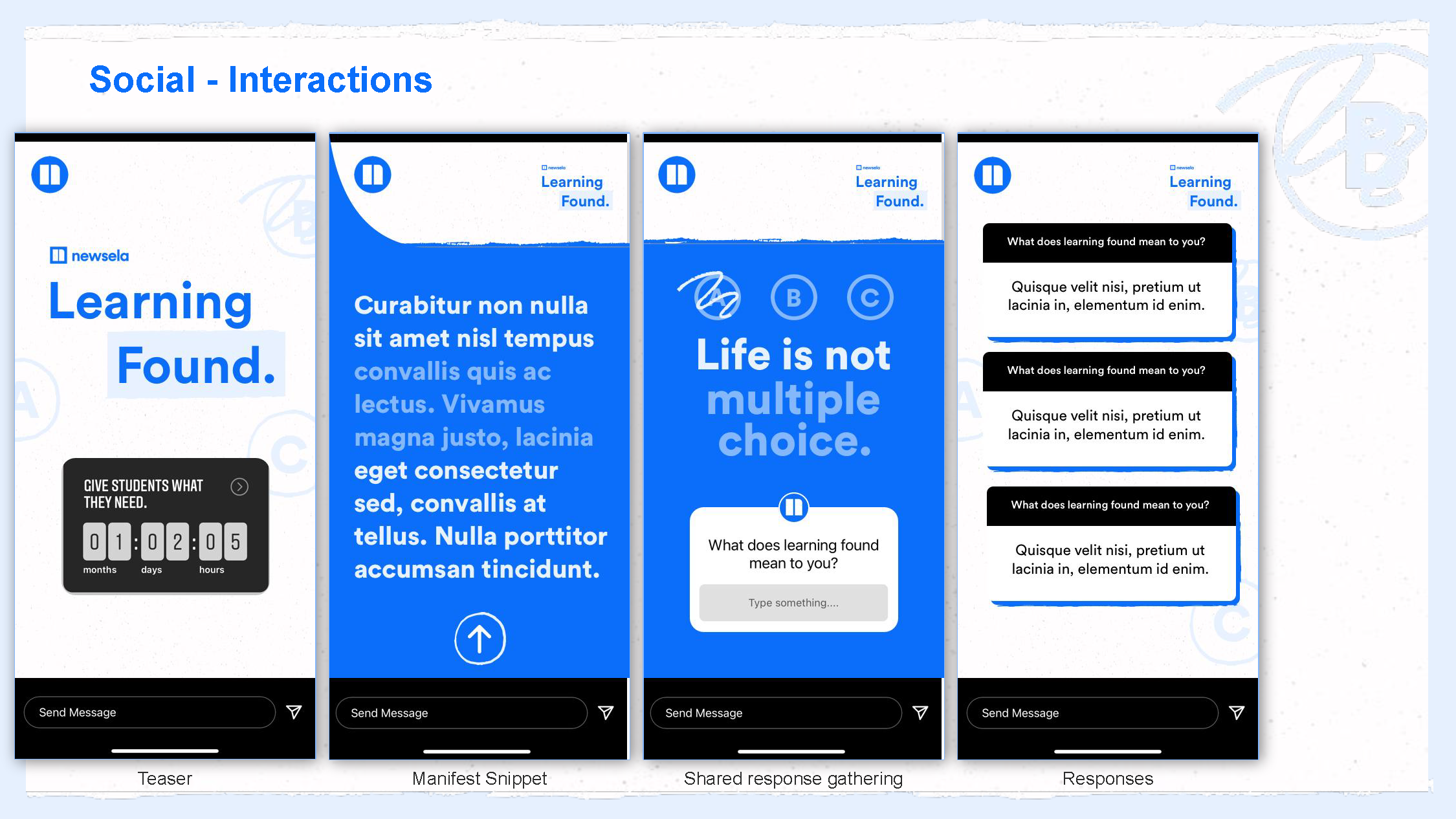
For this campaign I acted in a support capacity as the Design Lead on the Newsela side. Using the Agency’s creative brief, I created all of the campaign components ads, documents, decks etc to match their deliverable - A series of documentary style long-form videos. To make this work introduced texture, hand-drawn elements to call back to the students and less than perfect state of the world. I also significantly cut back on color, and introduced a cinematic black.
Role: Brand/Graphic Designer
Tools: Adobe illustrator/photoshop, Canva, Google Suite
Worked with: Executive suite, Agency - Video
Agency Led Video
Learning Found V2
There were two legs to this - I provided creative direction for this portion
Challenge
About 4 months after the initial campaign launch we identified a shift in trend - users/target personas were looking for uplifting positive content. Educators, already exhausted and burnt out were not resonating with the somber version of the learning found campaign. They also didn’t recognize the meaning of the name “Learning Found” and how it connected to learning loss. That said, the topics the campaign covered were still relevant presenting a challenge - how do we update this campaign so that it meets the audience’s emotional needs and evolve a campaign that was still relevant but misunderstood.
Solution
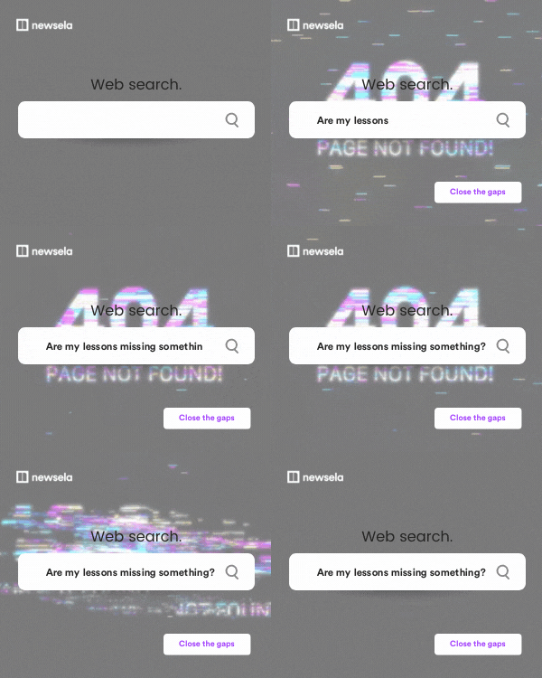
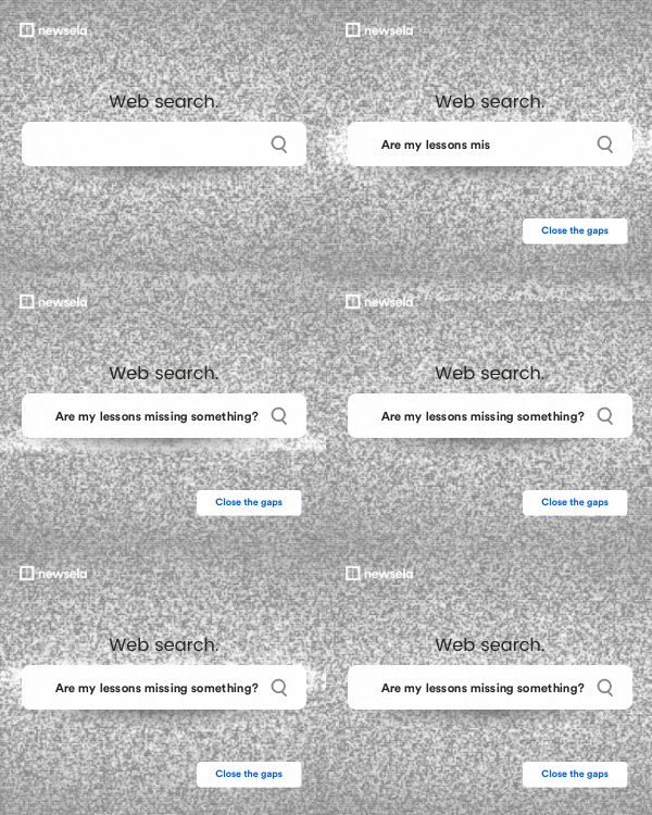
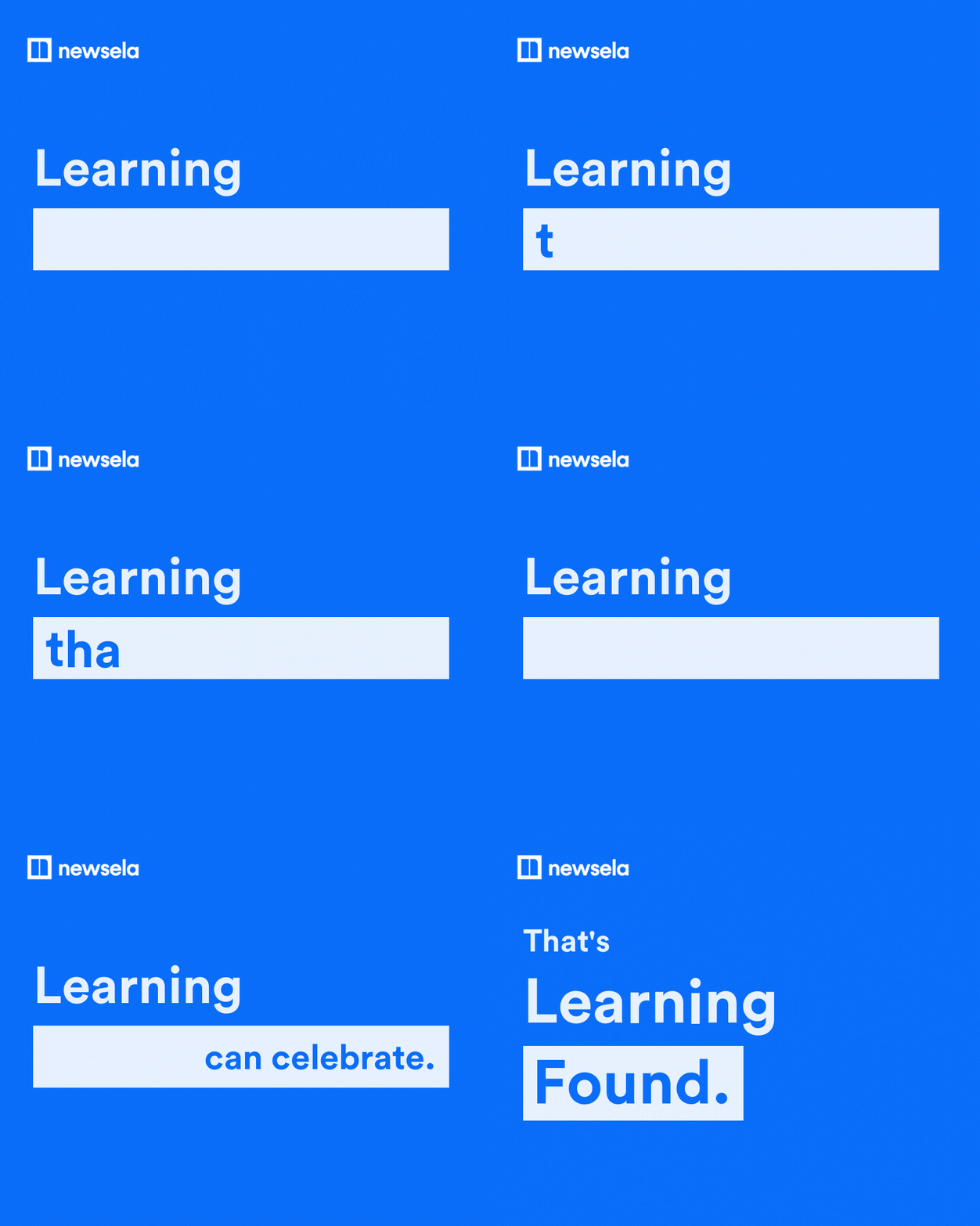
I essentially wrapped a new creative concept around the collateral from this campaign’s first leg. First thing, I worked to create a bridge ad campaign that helped folks understand what Learning Found meant - using motion and 404 not found in a clever set of ads that directed to learning found assets. They were our most effective ads to date.
We created a new exciting back to school video asset to re-launch the campaign and refresh our users pallet. Our agency had departed from our brand tone and voice in V1 of this campaign to be direct, gritty, and a little more aggressive than our norm - which is typically optimistic, knowledgable, and approachable. An easy first adjustment was to reframe the content and collateral of this campaign in our standard Brand tone and voice. Working cross functionally documents were lightly updated for tone across the campaign. I also significantly changed the imagery style - lighter brighter imagery that look forward to positive school experiences in the days to come rather than lingering on the negative experiences of the pandemic. This matched our collateral more neatly which was focused on improving student experience and learning moving forward.
Role: Creative Direction
Tools: Adobe illustrator/photoshop, Canva, Google Suite
Worked with: Executive suite, Senior Director Corporate Communications, Freelancer - Video execution
Examples of our 404 Bridge ad campaign.


